|
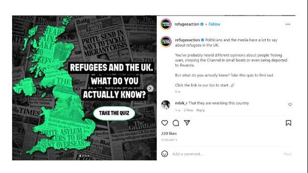
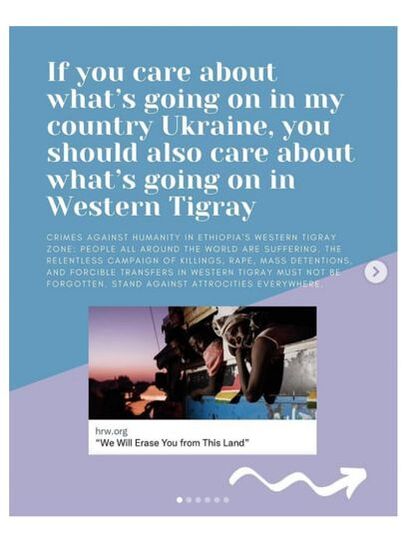
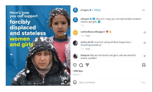
Is our obsession with infographics limiting our potential for empathy for the refugee experience? These days, when we think of the role social media plays in refugee issues, what often comes to mind might be something like this: Especially on Instagram, from which platform these screenshots have been taken, this form of reporting has become the most popular way for creators to spread awareness. In many ways, this is down to the inherent viral potential written into the nature of infographics: they are short, concise, and often come with bright colours and big numbers so that audiences absorb information faster. A refugee-centred infographic, differing from other corporate infographics, commonly forgoes extremely bright colours, opting instead to attract attention in the big headline. These headlines are formatted to encourage engagement - such as the above quiz example, or a leading statement like “how you can help __” - to maximise reader interaction. These attention-grabbing front slides have become the online version of news front pages in that they act as a headline of sorts. They reveal information incrementally in the following slides - normally we would find a new statistic or resource on each slide. These infographics often include a ‘conclusive’ page linking donation or information websites. In these ways they are designed to nurture both public interaction (in its viral potential) and action (in their resource building). The problem, perhaps, arises when such information, despite its easy to digest frameworks, becomes inevitably overwhelming. It's one reason why it has become an increasingly common comment on posts to question why X country isn't being discussed, but Y refugee crisis is. This is a direct result of an oversaturated market. Infographics have become such a trend in social media - for Gen Z, ‘Instagram, TikTok and YouTube are now their top three most used sources for news’ as Jigsaw Research found last year in News consumption in the UK - Ofcom - that they deserve a more critical look into how effective they are. We are already aware that the Gen Z perspective on refugees is influential for both the present and future; we should thus be careful that our informative pieces are as effective as they can be. I do not mean to suggest in this blog that infographics do not have their place. Only that perhaps they are limited in what they might achieve, and are occasionally even unintentionally counterproductive. It might be beneficial if we were to think about infographics within the framework of Dr Kenneth's The 7 Fundamental Human Needs, listed as:
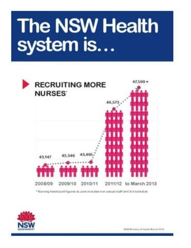
We might begin to question how many of these needs infographics provide an insight into. Perhaps number 4, contribution and participation, defined as “the need to contribute, care, and serve to make the people, community, and the world around us better,” meshes well with social media posts and infographics. What they lack could be numbers 2 and 3, connection and understanding. In being so focused on data, do we lack the visual and primal response we get when we are faced with reality? Pathos vs logos: Really, I’m asking if infographics miss out on the pathos (emotive) side of rhetoric, in focusing so much on the logos (logical). Of course, it’s impossible to fully understand a refugee’s plight until you’re met with being a refugee yourself. But isn't there a reason why moving images (see below) go just as, if not more, viral? What this picture does so well is that it focuses on the individual, something which I might argue is lost in the nature of infographics. By centering squarely on a moment of intense, emotive grief, we are forced to recognise the realities of human suffering. This might be uncomfortable - in fact, on this particular post, one commenter asked: “What's the need to share this photo?” To which another replied: “This picture might be difficult for you to look at, but this raises awareness of the impact of natural disasters on communities. It's a reminder to support disaster relief efforts and help vulnerable communities rebuild.” It is this difficulty of looking that is interesting here. It's often, in fact, preceded with ‘trigger warnings’ for vulnerable or sensitive users of social media. So, what does discomfort do for us, as witnesses to refugees, human sufferings and, in this case, the effects of natural disasters? What ‘triggers’ us? Is it more effective than data? Perhaps this simple binary of logos/pathos should be probed a little further. The visual is clearly a powerful rhetorical device, and it's one that should be integrated further with statistics. Pros of infographics: This is all not to say that infographics don't have their place in our perception of refugees and encouraging empathy and sympathy. Infographics, in their clear and concise collation of useful resources and links, are helpful devices to prompt readers to conclusions. A survey by New York-based company Infographics World found that 56% of companies queried use infographics, and 84% who’ve used them consider the medium effective. Why do infographics work? Some of the reasons include progressively shorter attention spans, thanks to smartphones, and the fact that humans absorb information faster with corresponding graphics (we may forget what we’ve read, but remember what we’ve seen). 90% of information transmitted to the brain is visual according to the report, and visuals are known to improve learning and retention by 400%. They did further research into how well each of the following mediums affect learning and retention of information most, according to the report: Infographics 61% Commercials 55% PowerPoints 48% Articles with images 46% Articles with text only 38% Blog posts 36% Ironically enough, blog posts engage the least learning and retention; consider this a personal plea to fight against this human instinct. In any case, infographics came up the highest. They’re also easily shareable, because their short and bold data make for great reposted Instagram stories. When crises occur, there is often an initial flurry of reposted infographics concisely explaining refugee situations: the cause, the condition, for example. It’s not uncommon to find one particular post going viral, and to see it reposted on multiple stories as you click through your feed. The question is: does this breed knowledge, or exhaustion? Does reposting the same thing overwhelm the average reader and eventually desensitise them? It varies, I suspect, from person to person, but it might be something to think about when discussing how we can improve our use of infographics and media in terms of the refugee cause. Cons of infographics: Despite these undeniable successes, infographics have their limitations when occupying the unique space of the refugee narrative. They have something of a distancing effect, for a few reasons. For one, data and statistics have never worked efficiently purely on their own shoulders - that is why we have logos, pathos, and ethos as rhetorical devices, not just logos. Humans do not do well on numbers alone. They also, in their viral potential, equally have the potential to unintentionally diffuse themselves in their own overpopulation. Seeing the same statistic forty-five times will not have the same effect as seeing it once, for the first time. And because they become viral, they become a trend. And what do trends inevitably do? Die down. A refugee experience becoming ‘trendified’ is extremely dangerous territory. Visuals can also be, however unintentionally, misleading. Colours that suggest one thing in one country may suggest an entirely different thing in another. Plus, the way the infographic visual is set out is important to get right. Consider the drawbacks to the following example: This one, from New South Wales, shows the increase in the number of nurses - the only problem is that you get a very different sense of scale from studying the image than you do if you just glance at it. Four stick people represent 43,000 nurses - yet 28 more stick people are used to represent an increase of just 3,000 nurses. That's a 700% infographic explosion to show a 7% increase. It is an ineffective infographic because the visuals do not match up cognitively with the information being given, despite being technically correct.
This is the type of mistake that becomes grave when considering it in the context of something as fragile as human life. Inaccuracies, intentional or not, become fake news; and after the mess that was the Covid pandemic, we do not need a reminder on just how acutely affecting to reality fake news can be. Conclusions: It might benefit us if we took a more dualistic or holistic approach towards how we use social media to express refugee issues. Evidently the refugee crisis is unique in that disturbing visuals actually work to our advantage sometimes (though we should be careful not to be reductive of the refugee identity to one solely victimised). To position infographics - or any media, for that matter - in a binary of simply effective or ineffective is reductive and diminishing. We might do better to simply concern ourselves with how we might improve said media. To this end, perhaps infographics would do well to inject themselves with a little more human connection. It is, after all, the most triggering to empathy and action. Refugees are not simply a statistic, and though statistics have their place in advertising and in garnering public awareness of the topic, they should be careful to avoid being reduced to numbers. So, my final question remains: In the saturated popularity of colourful analytical infographics, are we losing out on personal connections and empathy with refugees?
0 Comments
Leave a Reply. |
Author
Daniella is a second year English student at Oxford University. She researched and wrote this article as part of the Oxford University Micro Internship programme.
|


 RSS Feed

